
2024 / Case Study
Timesheets Checker
- UI & UX Design
- UX Research
- SaaS Design
- Stakeholder Engagement
- Cross-Functional Collaboration
- Multi-Role Design
Synnch Timesheets Checker dashboards help staff and admins work seamlessly together— streamlining R&D time submission, review, and ensuring nothing gets missed.
Designed for accuracy and compliance, it ensures all timesheet entries meet Australian R&D Tax Incentive requirements.
TLDR; Long Story Short
I designed the Synnch Timesheets Checker—an admin-facing tool for verifying and managing R&D timesheets in compliance with ATO/AusIndustry requirements.
Key Features
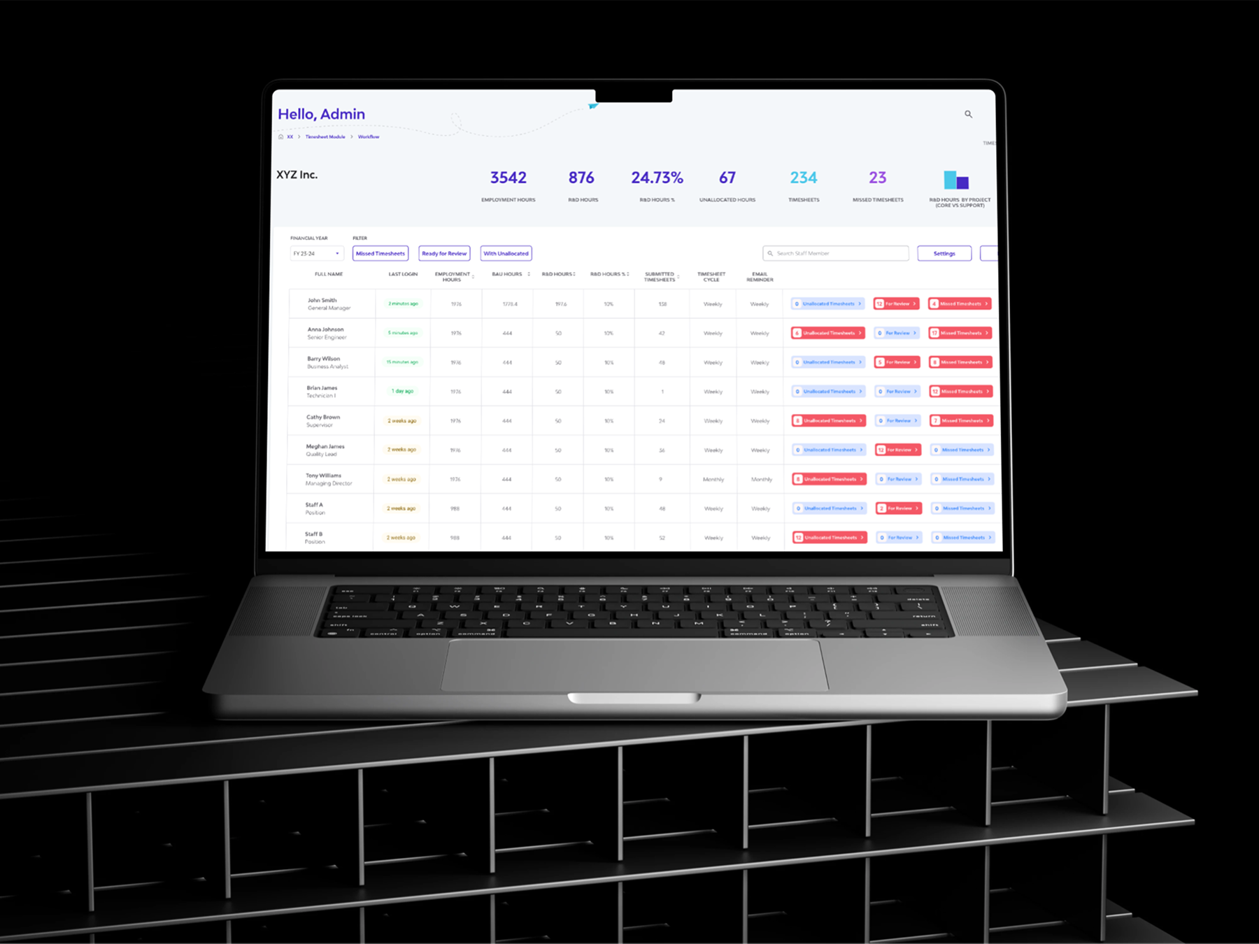
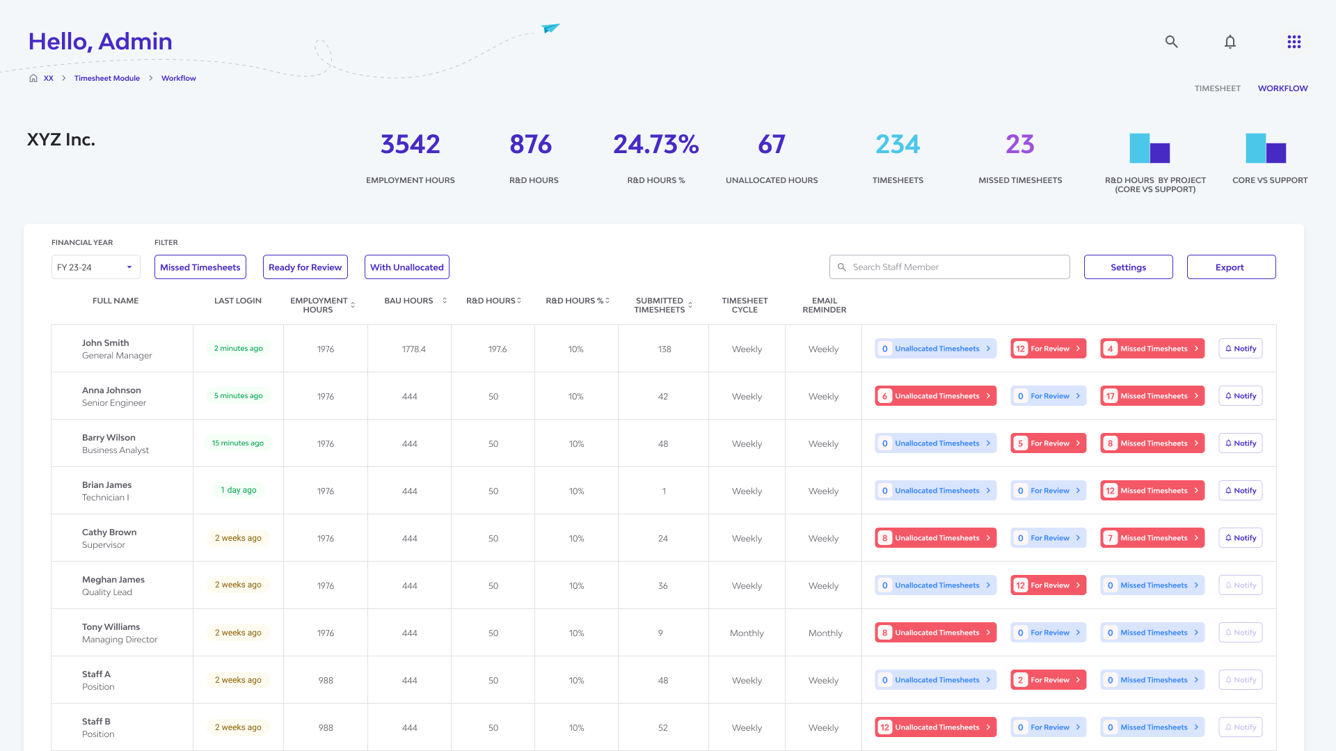
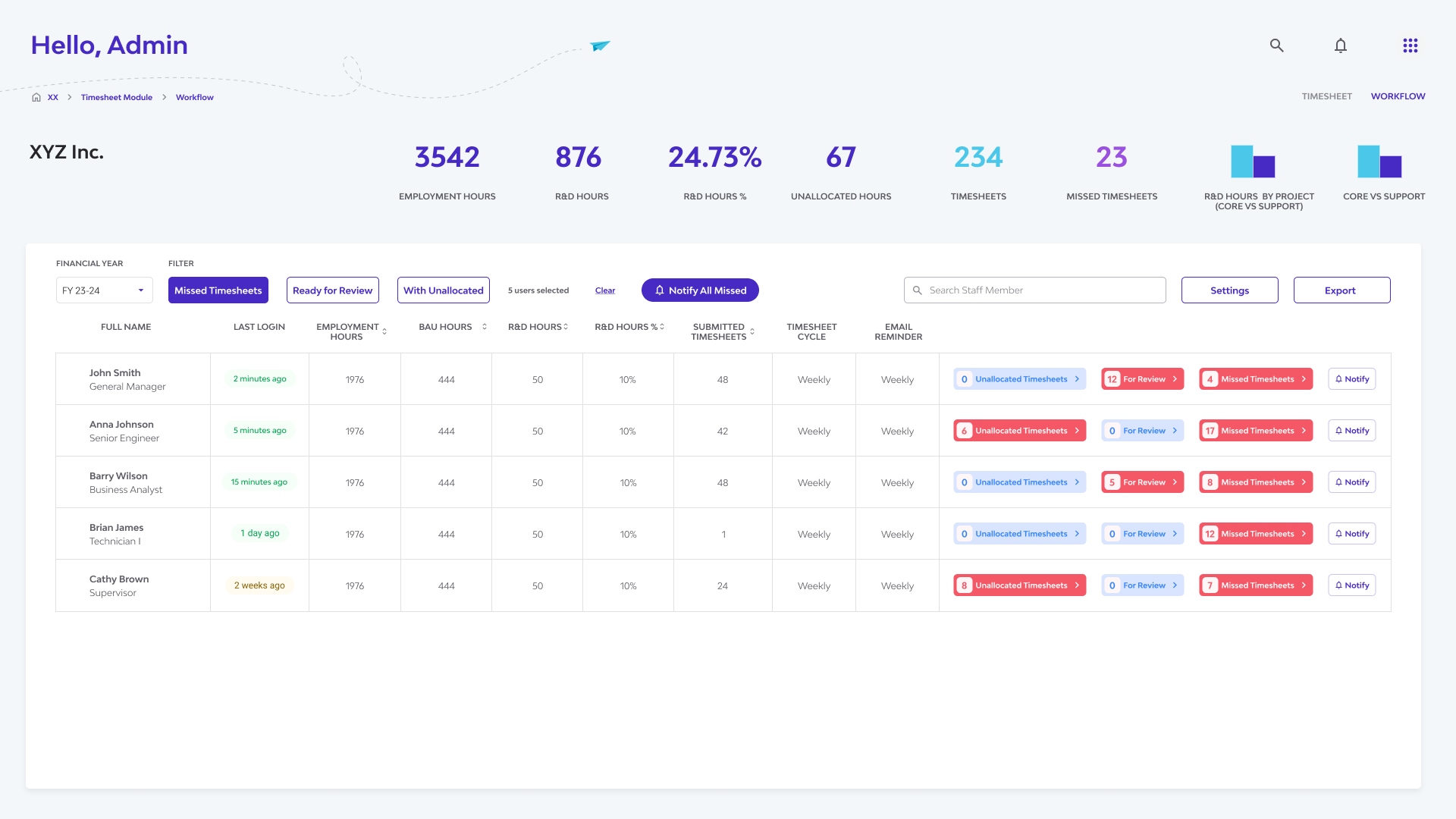
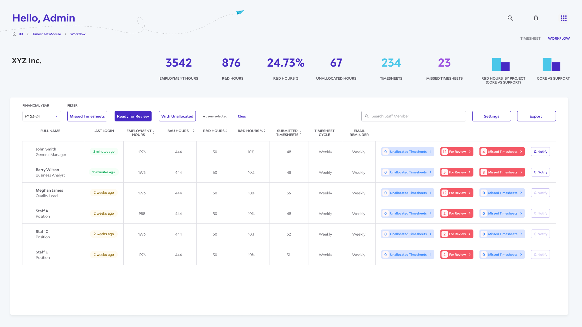
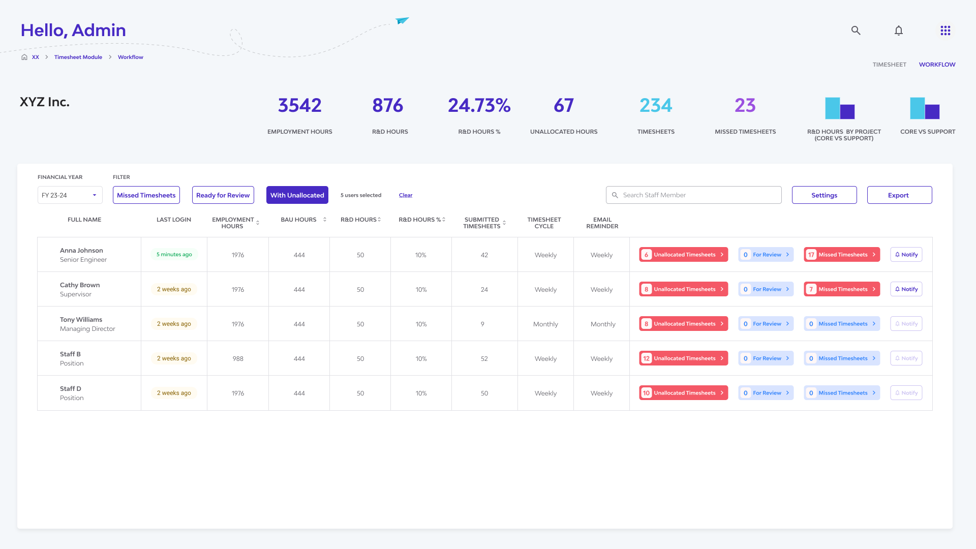
The Timesheet Checker dashboard highlights real-time KPIs and uses targeted workflows to help admins prioritise and resolve missed, submitted, or unallocated timesheets.
Impact
The new Checker tool made it easier for admins to spot issues, reduce manual effort, and stay on top of compliance—helping teams submit accurate timesheets on time and with confidence.
Key Takeaway
As the sole designer, This project taught me to design admin dashboards with an action-first mindset—highlighting what's missing or needs attention, not just displaying data.
I also learned to tailor interfaces based on user roles and time-sensitive workflows, ensuring the right context and controls for both admins and staff.
Thinking in terms of evolving data states and compliance timelines helped shape a more responsive, role-aware design.
Design Process
The Problem
Manually verifying large volumes of R&D timesheets is slow, error-prone, and lacks auditability —making it hard for admins to spot issues, ensure compliance, and drive timely staff submissions for ATO/AusIndustry requirements.
Research
Get reacquainted and revisit current patterns, and user flows in the timesheets module.
Identified the pain points, information needs, and desired level of control.
Uncovered inefficiencies and opportunities for automation and clarity.

Defining Roles and Users

Admins review and manage R&D timesheet submissions from staff, ensuring entries are complete, accurate, and aligned with compliance requirements.

Staff members perform eligible R&D work and log their hours, forming the core evidence that supports their company’s R&D tax incentive claims.
Key Insights
Admins needed a high-level dashboard to quickly spot critical issues.
The interface needed to support proactive admin actions—such as flagging late submissions and notifying staff—while providing staff with a clear, simplified view to address flagged items.
Since this is a verification-only tool, the UI had to enforce clear boundaries—allowing admins to review and flag entries without modifying core data, which is managed in the primary Timesheet UI.
UI Sketching
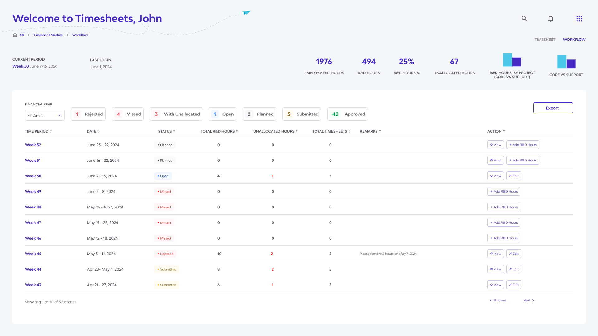
I designed the Timesheets Checker dashboard with clear KPIs and status filters, structuring the main admin table for high information density using stacked cells to improve scannability.
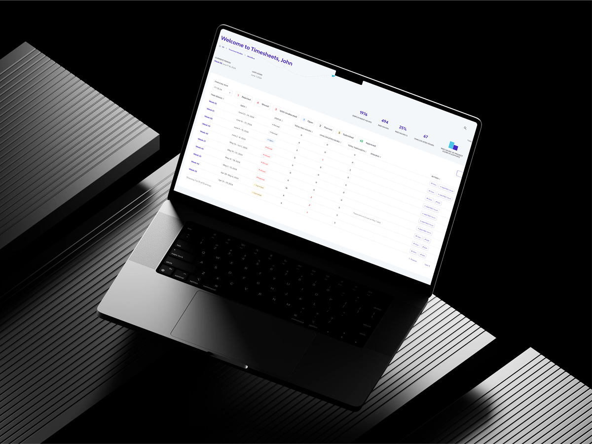
I mapped out key workflows for reviewing Unallocated, For Review, and Missed timesheets, and created a complementary staff view focused on clarity and guiding users toward required actions.
Design Execution
Admin Dashboard Table
With dozens—or even hundreds—of timesheet entries flowing in, admins face information overload.
For large teams, tracking compliance and data integrity becomes a major challenge.
The table layout supports at-a-glance scanning, sorting, and filtering. Key data points are highlighted for quick decision-making.
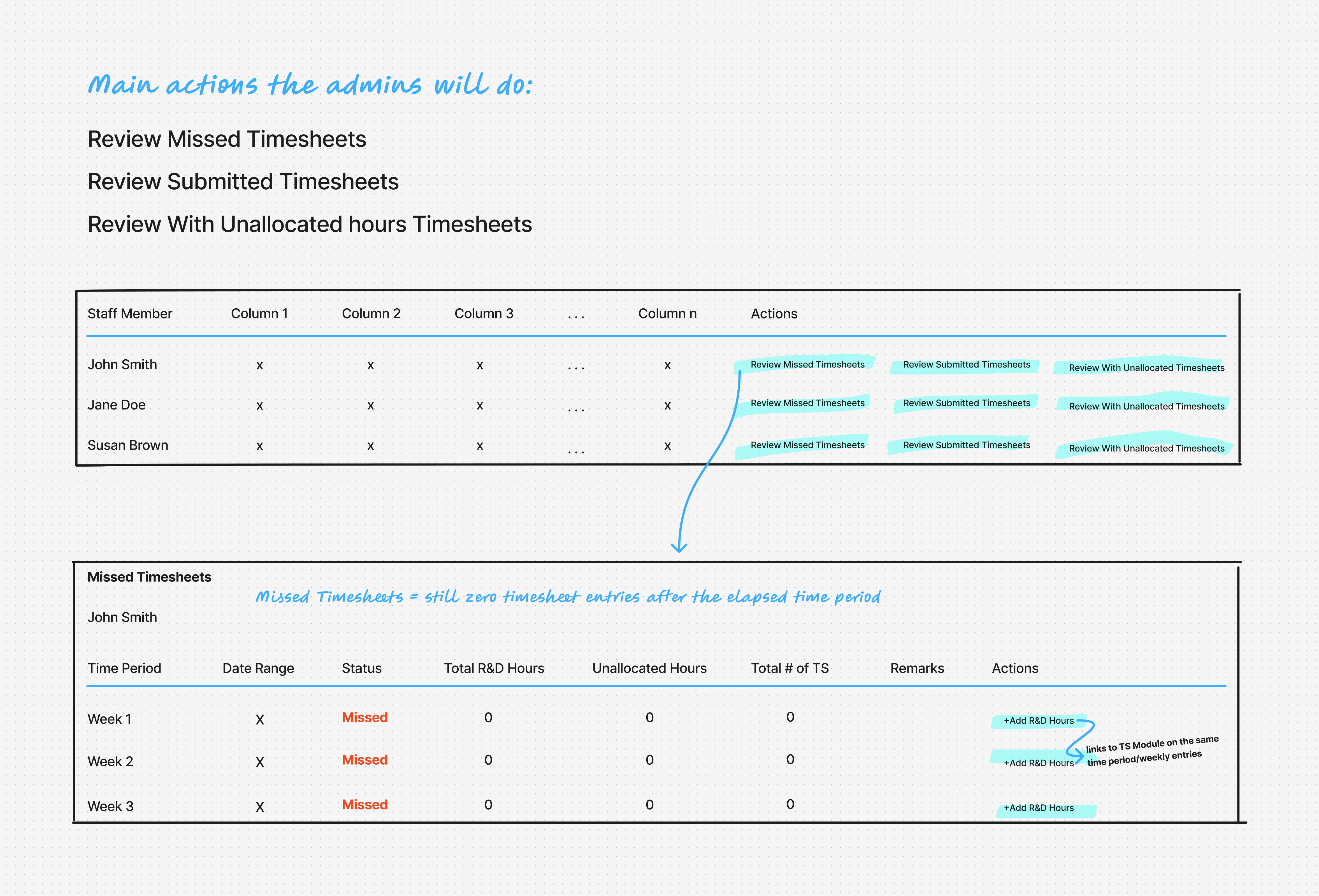
We defined the primary admin actions and designed the table to surface them clearly:
The goal wasn’t just to display staff and timesheet data—it was to prompt meaningful action. By prioritizing clarity, actionability, and visual hierarchy, we’ve made it easier for admins to maintain compliance and spot issues fast.
Iterated this design since the first draft was convoluted and lacks the emphasis of the 3 main actions.
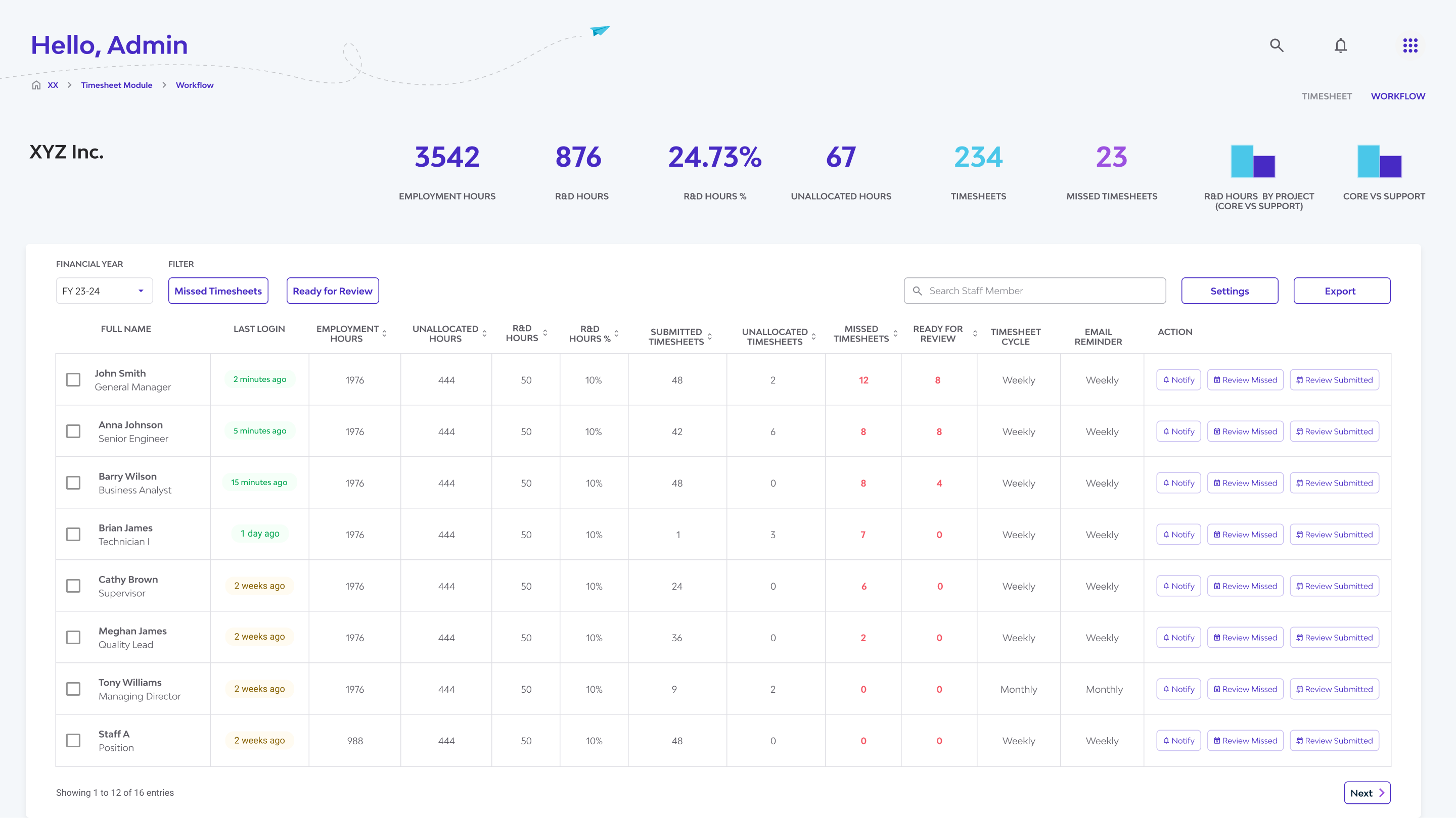
Actionable status pills like Unallocated, Missed Timesheets, and For Review help admins focus on what’s urgent in a content-heavy timesheet view.
Refer to R&D hours that haven't been formally tagged to any specific activity. By the end of the financial year—and especially during R&D tax incentive submission— these hours must be fully allocated for compliance.
Displays timesheets requiring admin review. Admins can Approve or Reject a submission and can add remarks.
Periods within the selected cycle where no R&D hours have been recorded , and the time window has already passed. E.g. A monthly cycle allows more leeway, while a weekly cycle enables quicker tracking. The goal is to encourage regular logging of R&D hours by staff and admins—ultimately aiming for zero missed timesheets.
Staff Dashboard Table
Staff members often struggle to track which R&D timesheets they’ve submitted and what still needs attention.
While they could manually check each month, there was no centralized or automated way to view submission status or alert admins of the gaps.
We created a staff-facing table view that summarizes each user’s R&D time entries across a selected time period.
It highlights what’s been submitted, what’s missing, and what needs revision—all in one place.
This design promotes clarity, accountability, and compliance. It gives staff members a real-time feedback loop to guide corrections or completions, and helps prevent missed or incomplete entries.
It also reduces admin overhead by making staff self-aware of their progress—turning compliance into a shared responsibility.
Learnings and Reflections
Representing R&D compliance concepts like contemporaneity or cycle-based tracking in an intuitive way was a major UI challenge. I had to find ways to surface these rules clearly without overwhelming the user.
Admin tools required a lot of data in one view. Finding the right balance between information density and ease of scanning meant refining layouts, typography, and interaction feedback carefully.
Since the Checker UI was meant for verification only (not editing), I had to clearly define boundaries—ensuring users could take action about data without accidentally modifying it.