
2025 / Case Study
Timesheets Module
- UI & UX Design
- UX Research
- SaaS Design
- Stakeholder Engagement
- Cross-Functional Collaboration
- Multi-Role Design
Synnch is a cloud-based platform that helps Australian businesses track and manage their R&D tax incentive claims.
It makes it easy for teams to record work hours, link them to specific R&D projects, and keep accurate records—ensuring compliance with government requirements.
The platform is designed for staff doing the R&D work, project managers, and consultants who handle the claims process.


TLDR; Long Story Short
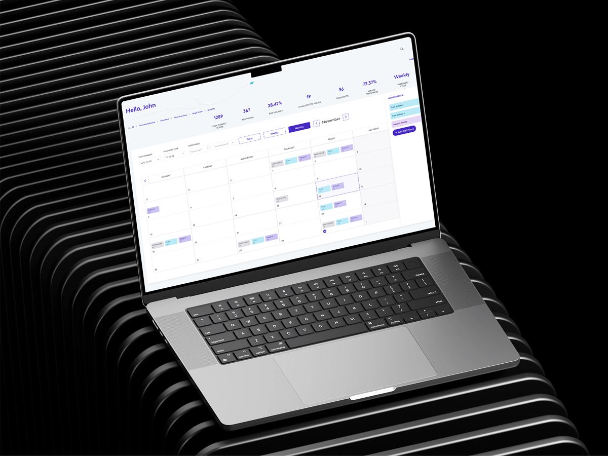
I designed a dedicated, compliant timesheets module with different views (daily, weekly, monthly, table) focused on ease of use, data accuracy, and reviewability.
Key Features
Flexible input for R&D hours, support for contemporaneous entries, and multiple review views (daily, weekly, monthly, table) enabling different user roles to validate and manage their time entries effectively.
Impact
The module simplified time entry for busy teams while making it faster and clearer for reviewers and consultants to validate R&D claims.
Key Takeaway
As the sole designer, This project was a hands-on lesson in designing for the realities of SaaS: evolving requirements, technical constraints, and the need to integrate new features into an existing ecosystem—without compromising on user experience.
Design Process
The Problem
Businesses claiming the R&D Tax Incentive face a critical disconnect: compliance requires timely, detailed timesheets, but workflow realities often push R&D documentation to the last minute.
Hours were often guessed instead of accurately tracked, putting the R&D claim at risk.
Managers found it difficult to monitor and confirm R&D work across the team throughout the year.
Using rough estimates and inconsistent staff rates led to smaller R&D claims than what could have been recovered.
Research
Understand business goals, compliance requirements, and system constraints.
Gathered narrated insights from a small group of R&D consultants who regularly interact with the end users and manage claims.
Reviewed R&D claim requirements, and data compliance expectations as mandated by the ATO in Australia.
Defining Roles and Users

Help Claimants prepare and lodge their R&D Tax Incentive Claims to the Australian government.

Oversee R&D efforts to secure funding, ensure team compliance, and maintain visibility across activities and contributions.

Staff members perform eligible R&D work and log their hours, forming the core evidence that supports their company’s R&D tax incentive claims.

Review and manage R&D timesheet submissions from staff, ensuring entries are complete, accurate, and aligned with compliance requirements.
References and Inspiration
To start, I examined a variety of timesheet and calendar-based enterprise platforms for UI inspiration
This helped me understand different interaction models, layout options, and UI components commonly used in time management systems.
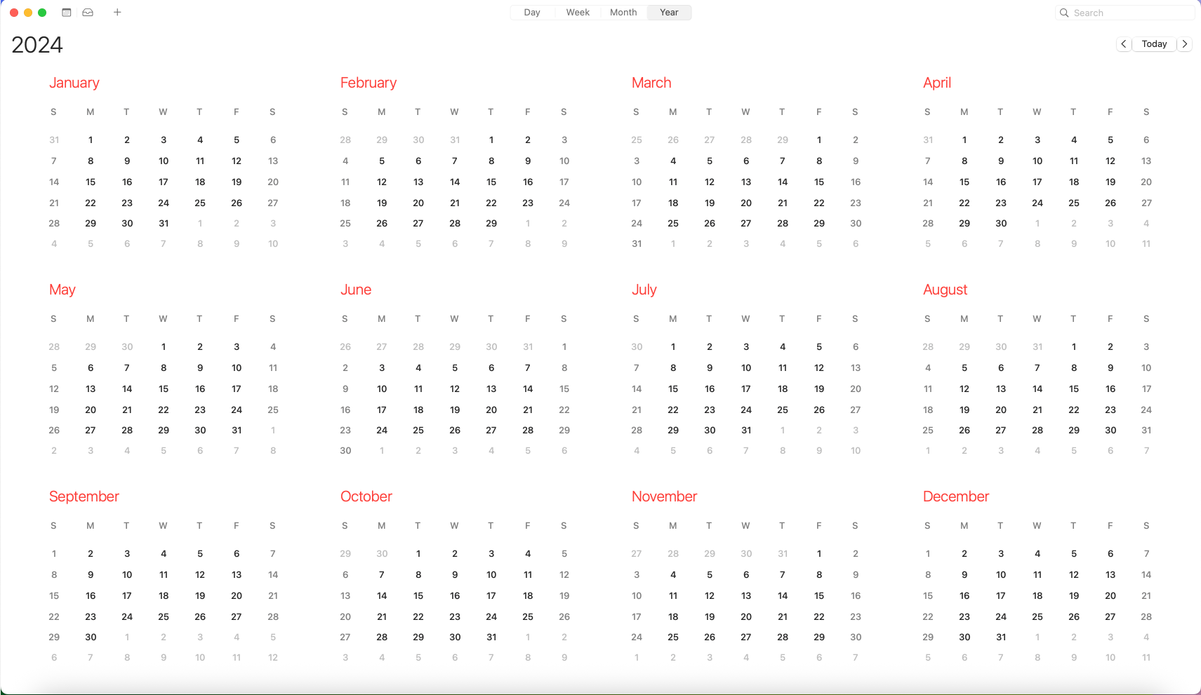
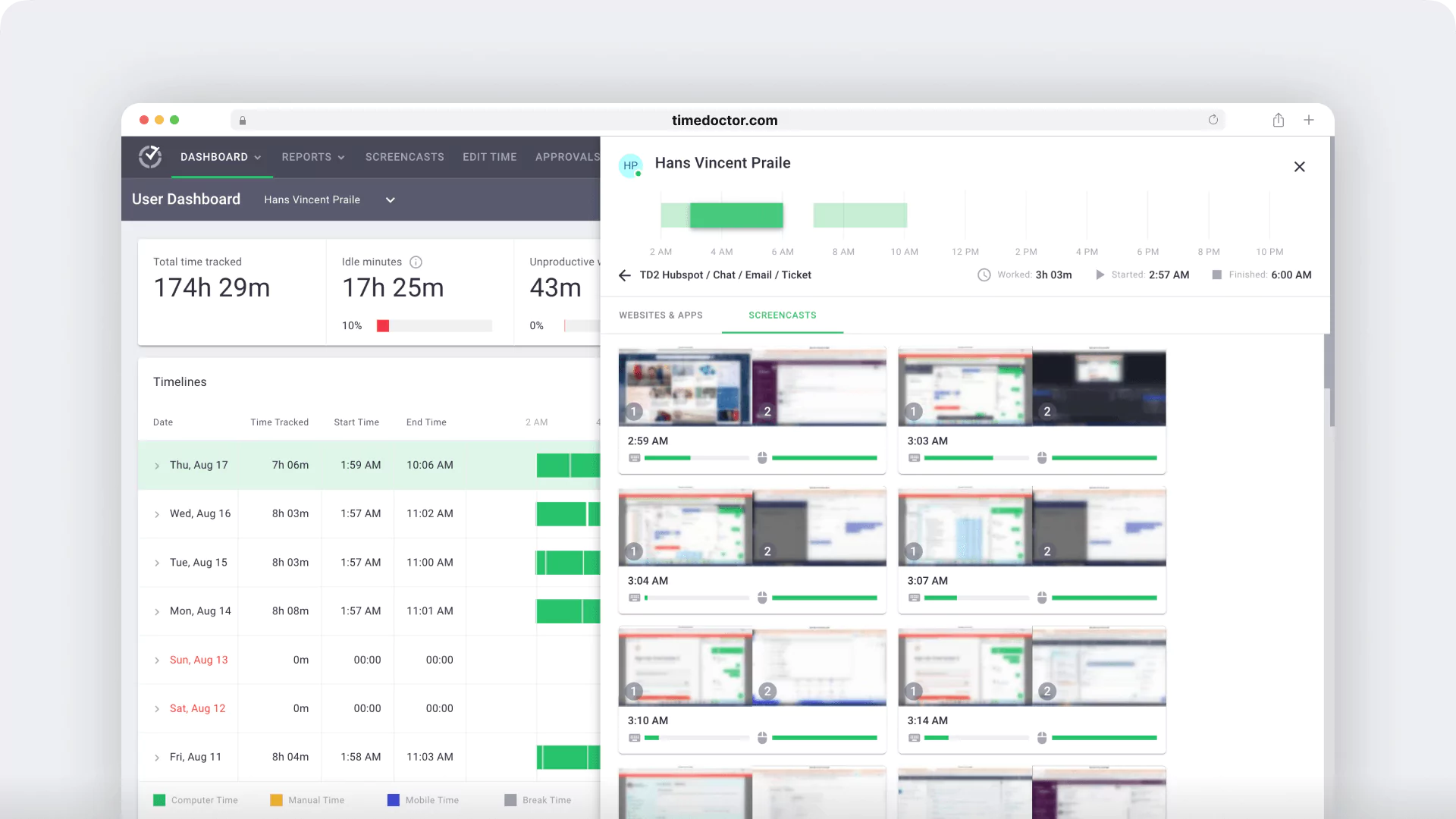
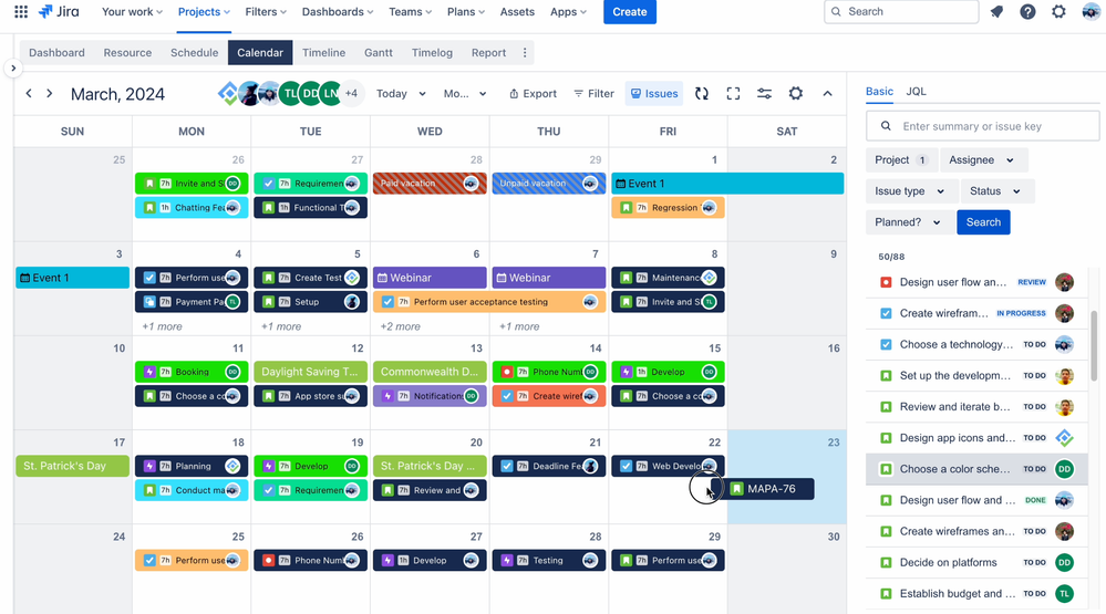
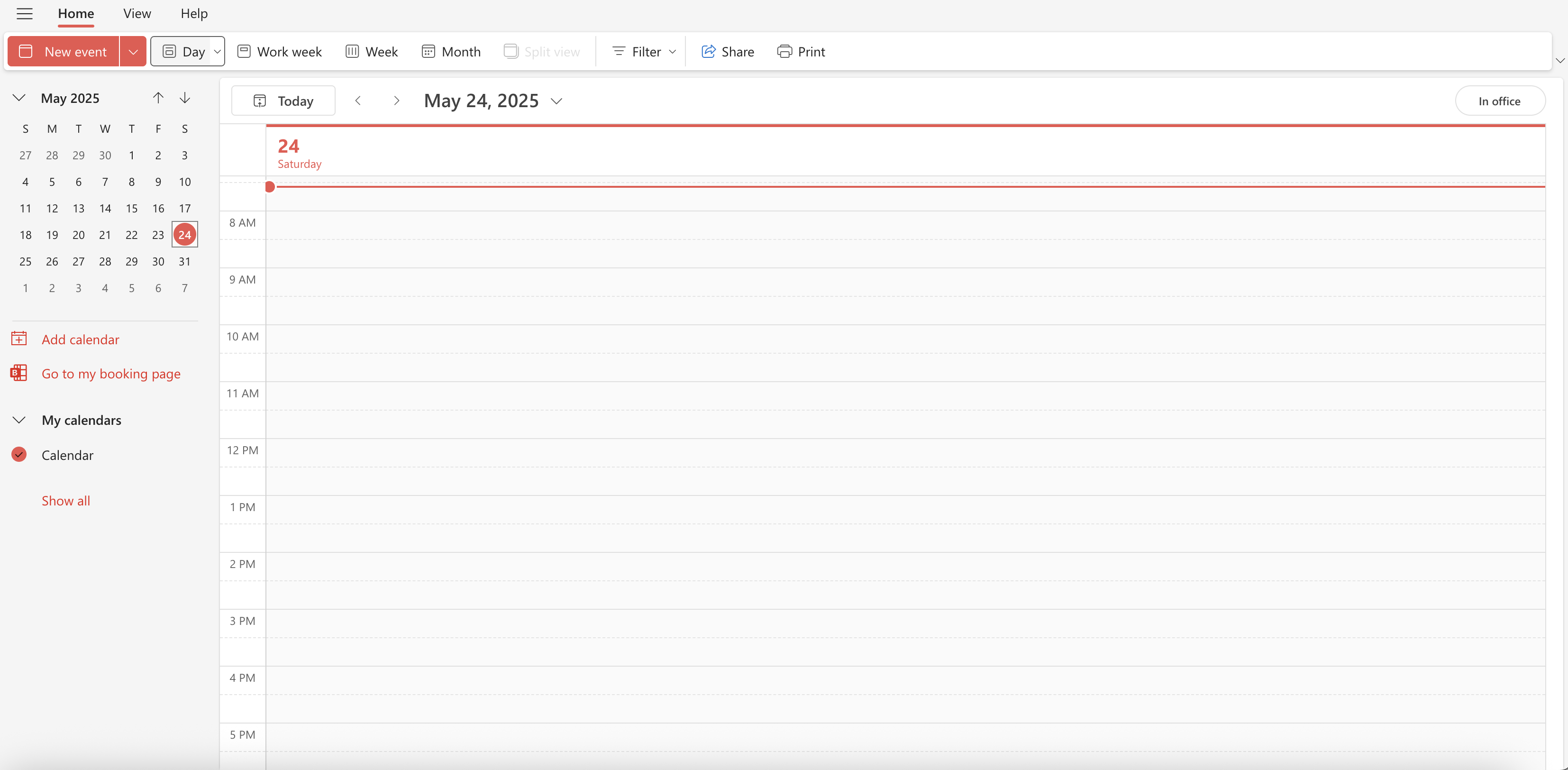
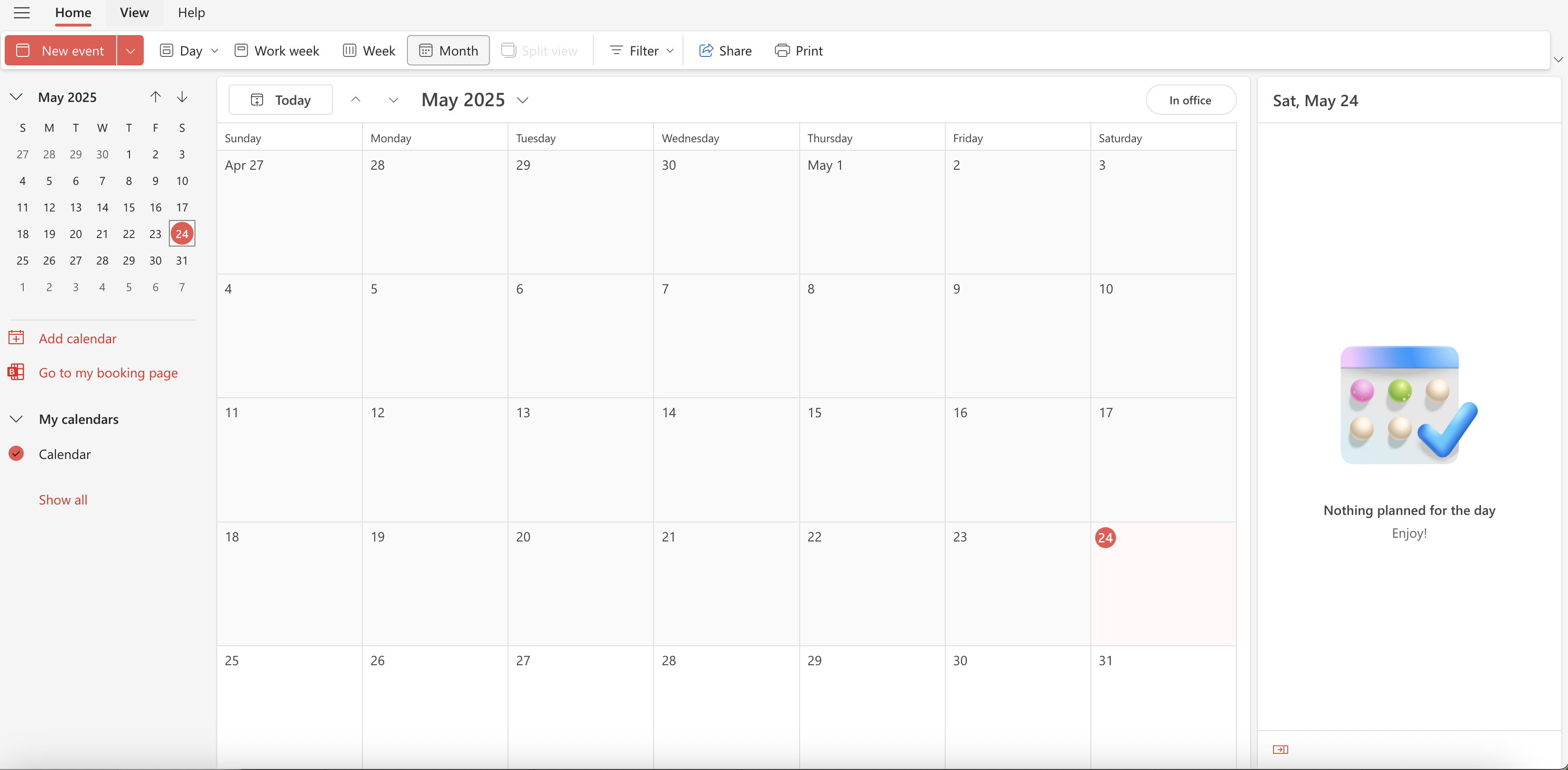
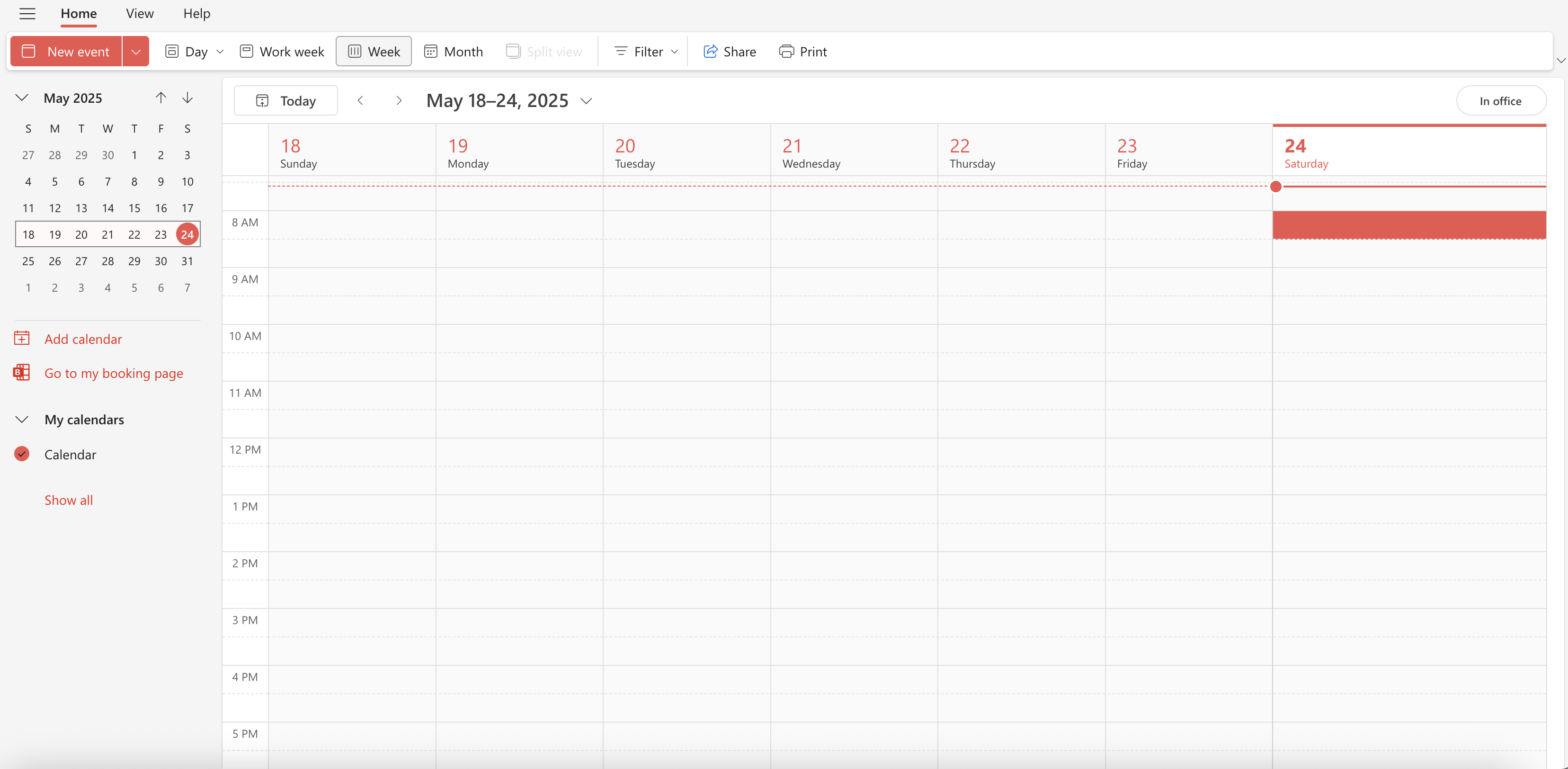
This timesheet design takes inspiration from Outlook and macOS calendars for familiar scheduling, Time Doctor for detailed time tracking, and Jira for linking work to specific tasks and projects.
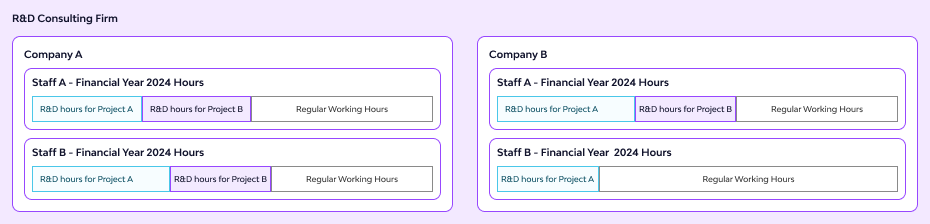
Visualizing Synnch’s R&D Hierarchy
Synnch follows a tiered structure where R&D consultants manage multiple companies. Each company has staff members who log R&D hours under core or supporting activities. This setup allows tracking R&D activity by company, staff member, project, or timeframe—from year down to day.
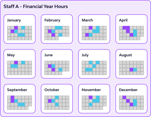
Visualizing R&D Hours vs Regular Work Hours
ProblemRecording daily R&D activity alongside regular work hours creates visual clutter—especially when adding required supporting data like descriptions and evidence. This becomes overwhelming in weekly or daily views.
Designed SolutionTo reduce noise, the interface prioritizes R&D hours over regular work hours. Core activities are highlighted in blue, supporting in pink, while regular hours are visually minimized.
WhyThe design supports clearer visibility of claimable work, improves usability at scale, and helps staff and admins stay compliant without overwhelming the screen.
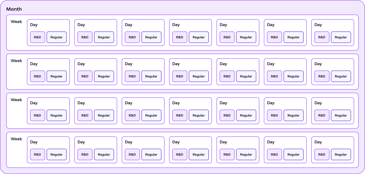
UI Sketching
I'm exploring ways to design a calendar or table that lets users easily switch between granular R&D hours and higher-level daily, weekly, monthly, and table views.
My goal is to prioritize the most important data at each level, while finding the right place to show supporting details without overwhelming the interface.
Design Execution
Multiple Views
R&D Hours can mean differently to a staff member, consultant, claimant, or auditor.
These hours must be viewed differently but doesn’t change the fundamental details.
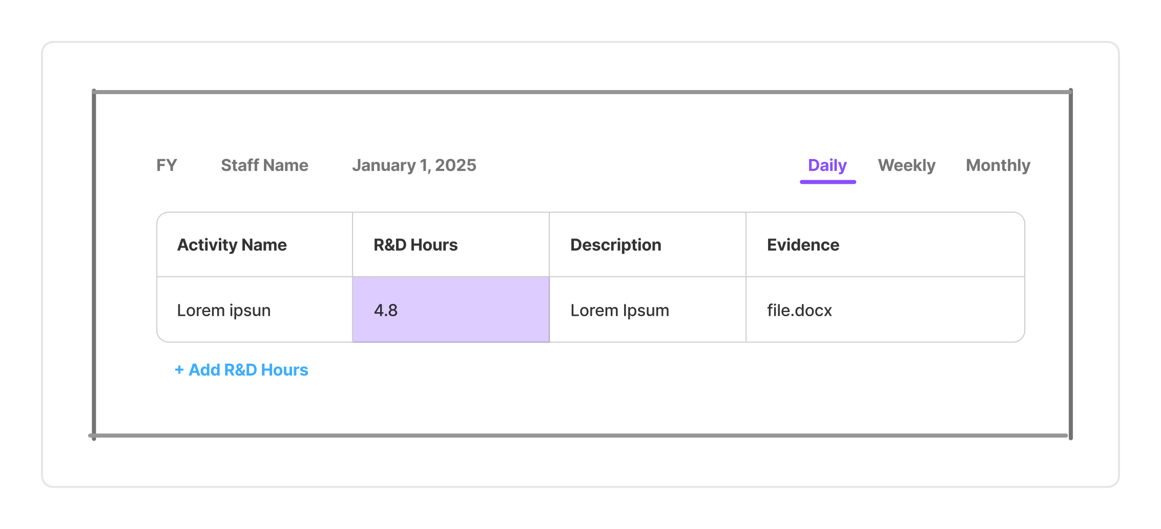
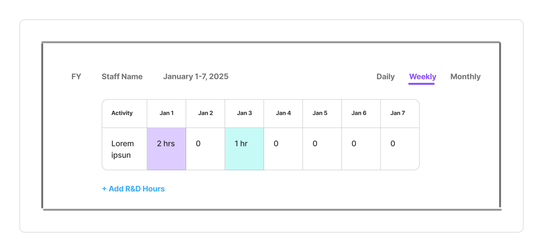
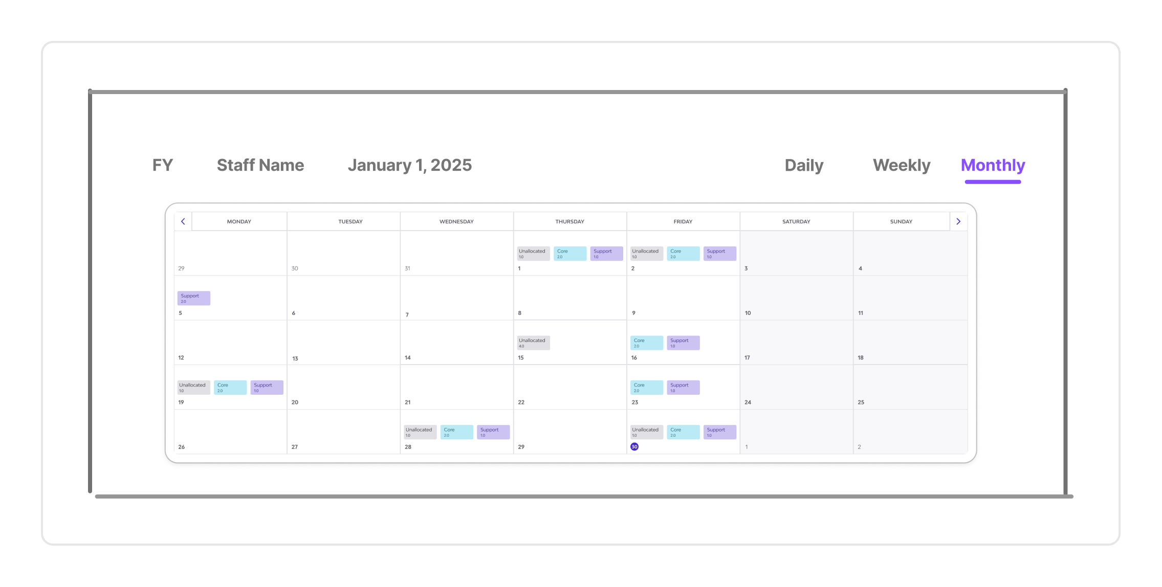
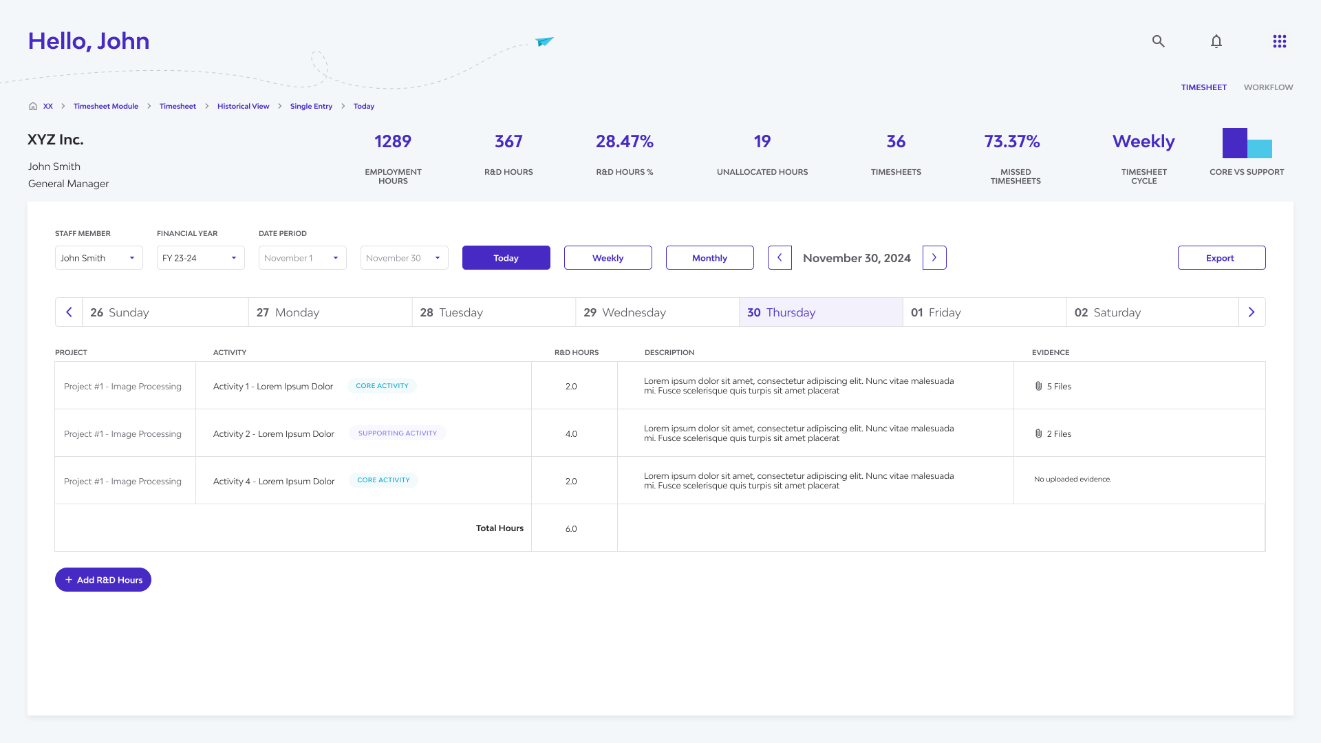
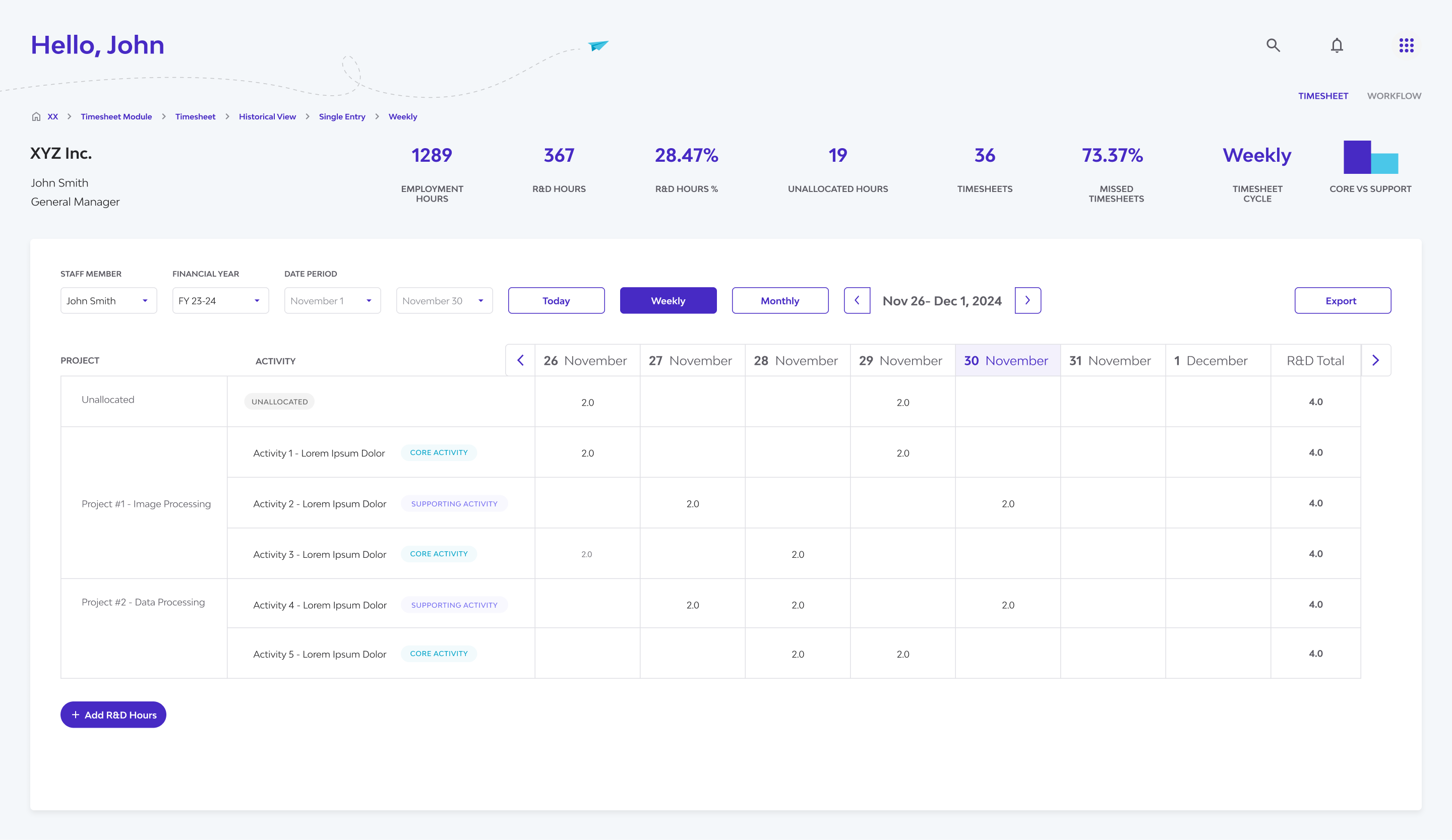
Users can seamlessly switch between daily, weekly, monthly, table view, and a detailed side panel view using clear tabs or buttons. This caters to different user needs – from quick daily checks to weekly summaries and in-depth data scanning.
I designed multiple timesheet views—daily, weekly, monthly, and table—to help users easily switch between granular and high-level insights. This supports both day-to-day tracking and compliance-ready overviews, making it easier to distinguish R&D hours and prepare for audits.
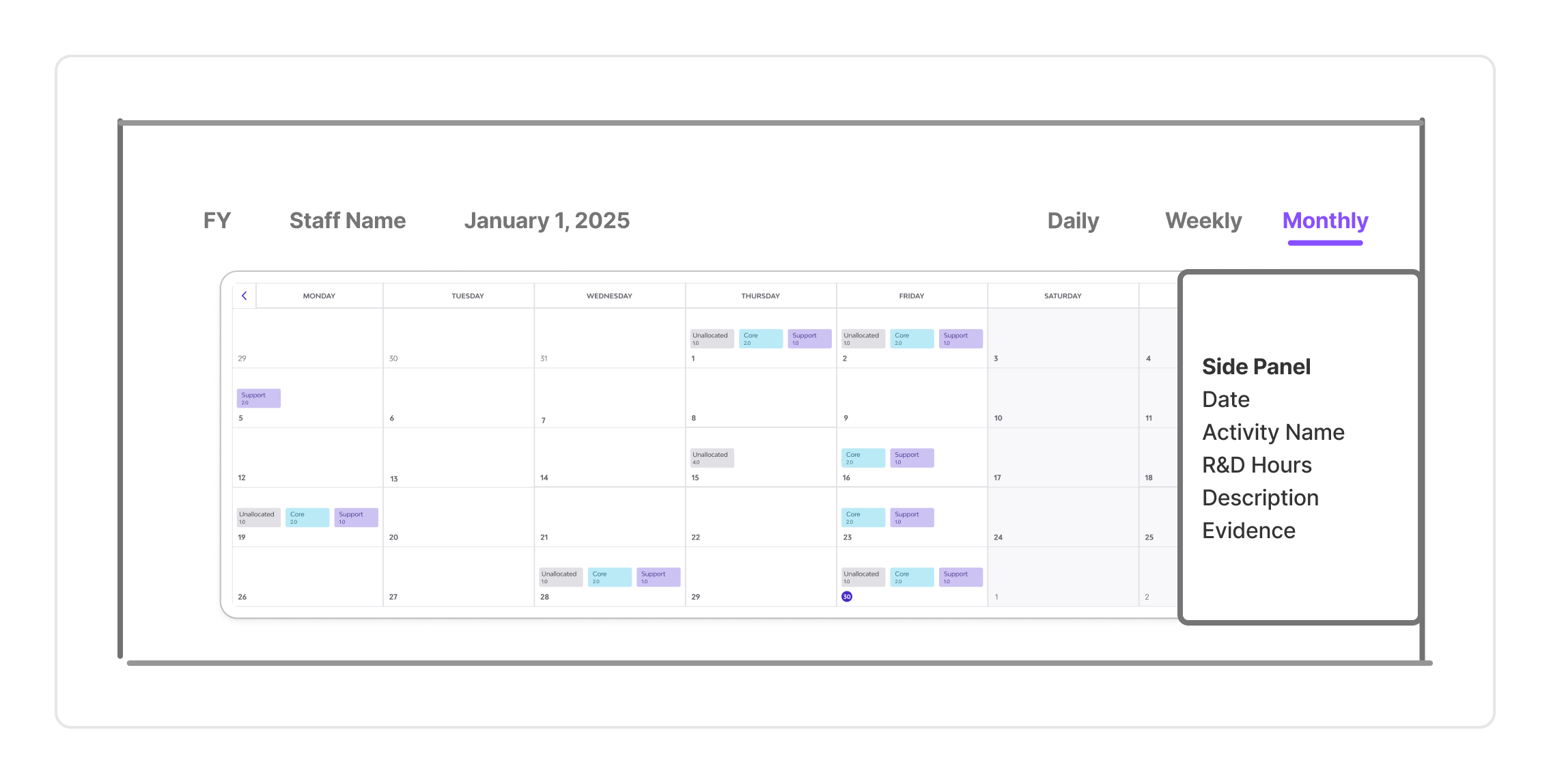
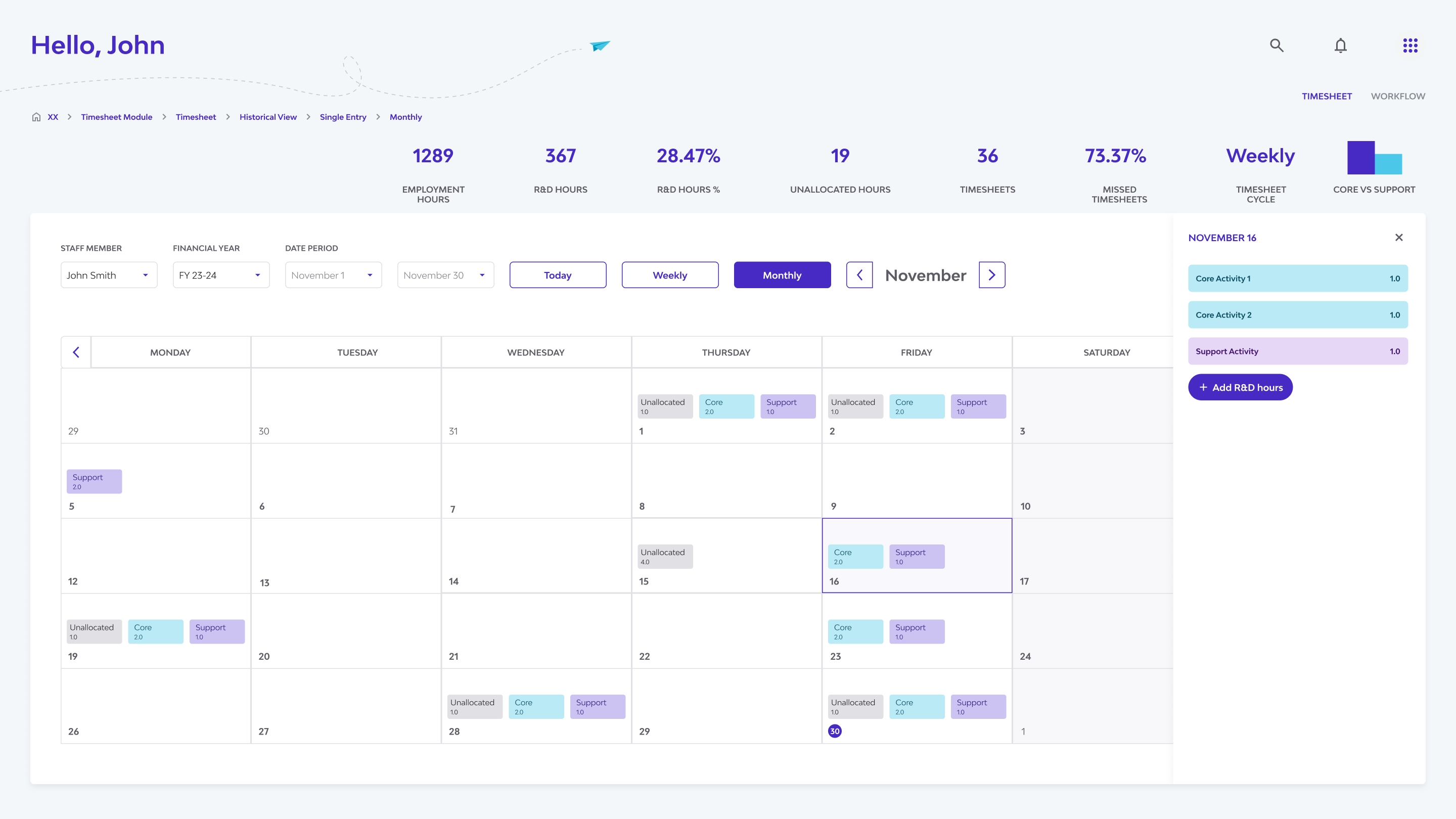
Designing the Side Panel
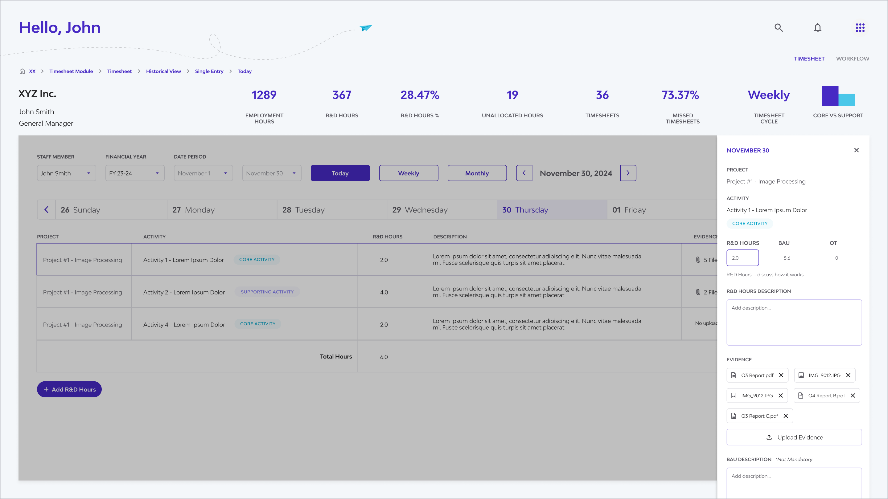
In a traditional calendar view (daily, weekly, monthly), not all details can fit on the screen, especially when monthly and multiple staff members are selected.
This component became essential for displaying detailed logs, comments, or evidence attachments linked to a selected time entry.
The side panel lets users view and edit details while keeping the main table visible —making multitasking smooth and uninterrupted.
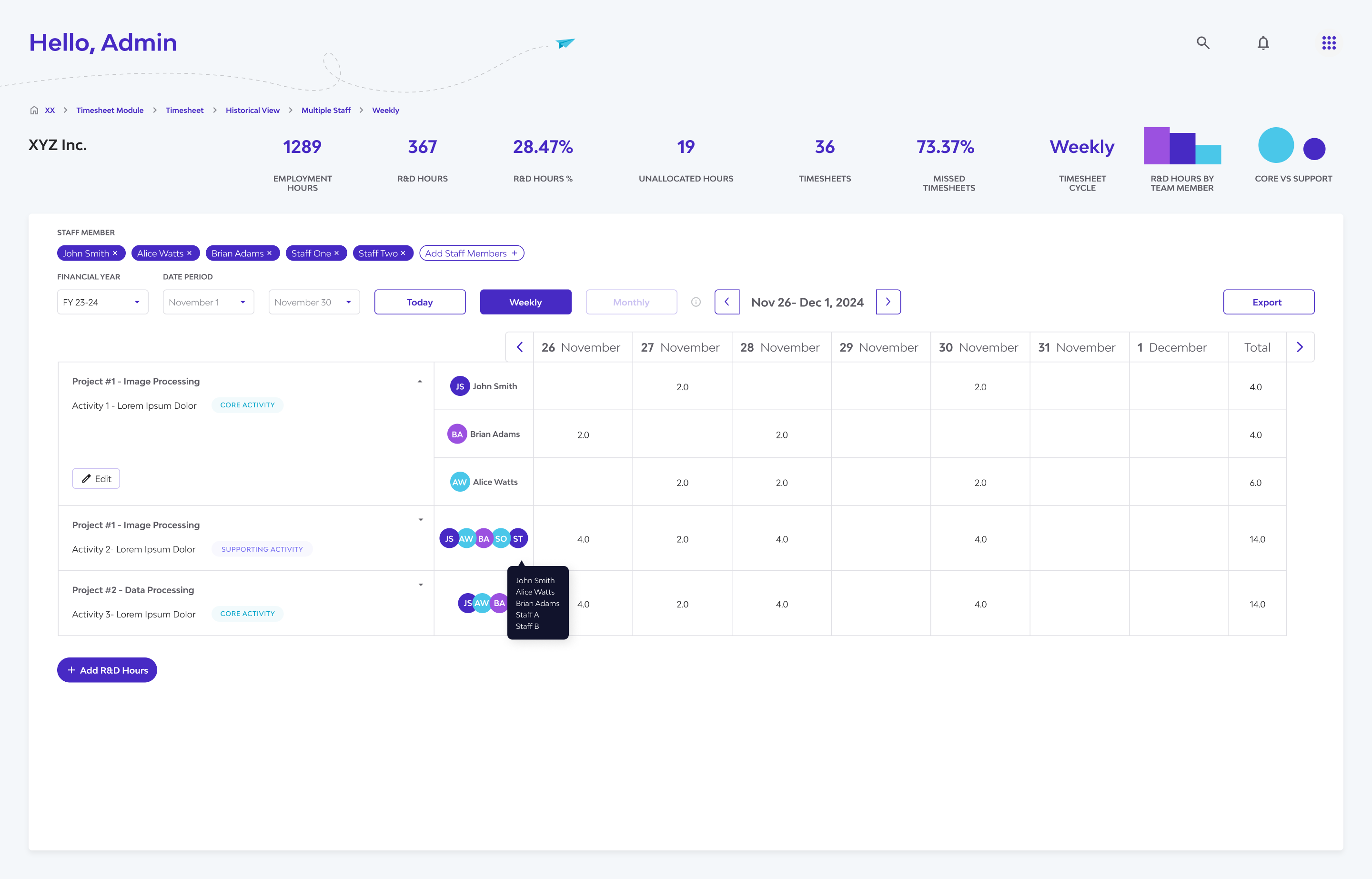
Multi-Staff View
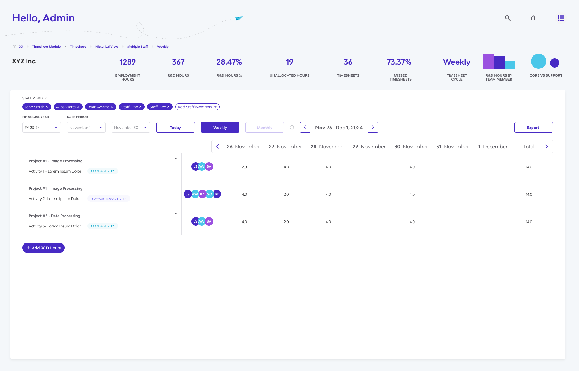
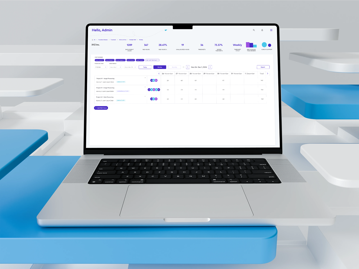
Admins, consultants, and claimants need to compare multiple staff members' R&D timesheets to assess total R&D hours spent on projects or forecast and reconcile budgets
We introduced a Multiple Staff View specifically for admin-level users to analyze several timesheets side by side—without needing to open multiple tabs. Users can quickly compare daily or weekly entries across team members in one unified view.
Multi-staff view is a core feature that sets the Timesheet Module apart. It lets admins and consultants compare team data in one place—no tab-switching making reviews faster and more effective.
- Limited to daily and weekly views to maintain clarity and performance
- Monthly view excluded due to data density—users are instead directed to use the table view for a higher-level overview
Settings
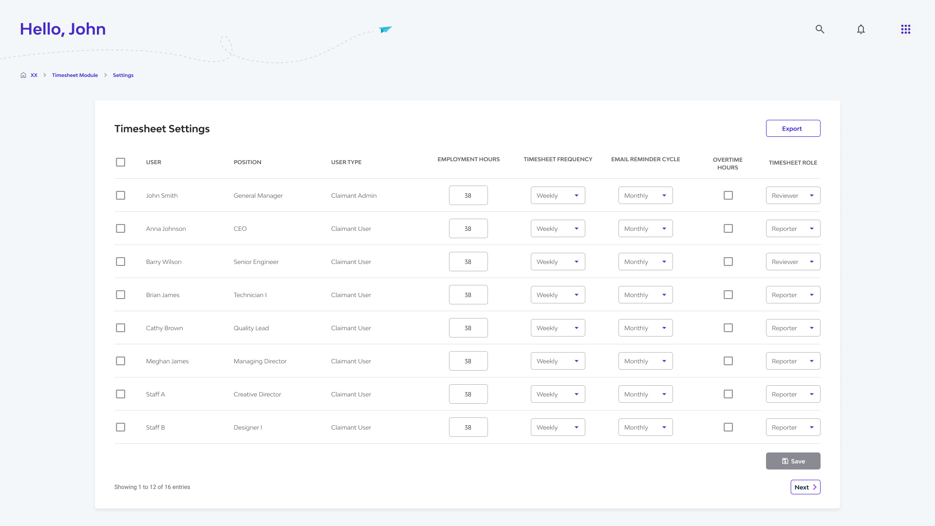
Staff members often have varying conditions—different hourly rates, overtime rules, and features to enable or disable—making standardization difficult.
We introduced a centralized Settings page where admins can view, customize, and edit each staff member’s configuration with ease.
Having an all-in-one, summarized view allows quick access and streamlined updates, reducing admin overhead and ensuring accuracy across the team.
Learnings and Reflections
As the sole designer, I learned to bridge design with technical and business needs—collaborating closely with developers and stakeholders, connecting the Timesheets module to the broader platform, and anticipating future requirements.
I also gained experience juggling multiple roles, from writing usability test guides to designing a UI that was not only intuitive and visually polished but also backwards compatible and future-proof.